Creative Direction

Ron­pak

Building a brand language from scratch, with a logo we could not touch and paper we turned into a design system.

Client Ronpak
Agency MAP360 Collective
Year 2025
Scope Brand Identity, Web, Photography, Video
Role Creative Director
Deliverables Brand System, Website, Photo, 2x Video
Ronpak brand system overview

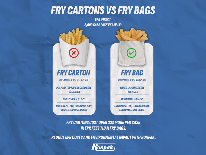
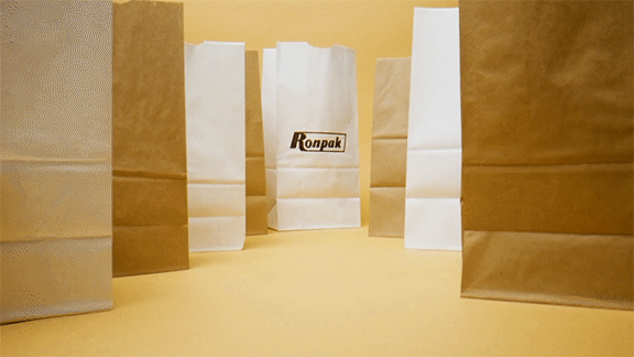
The Problem With Paper

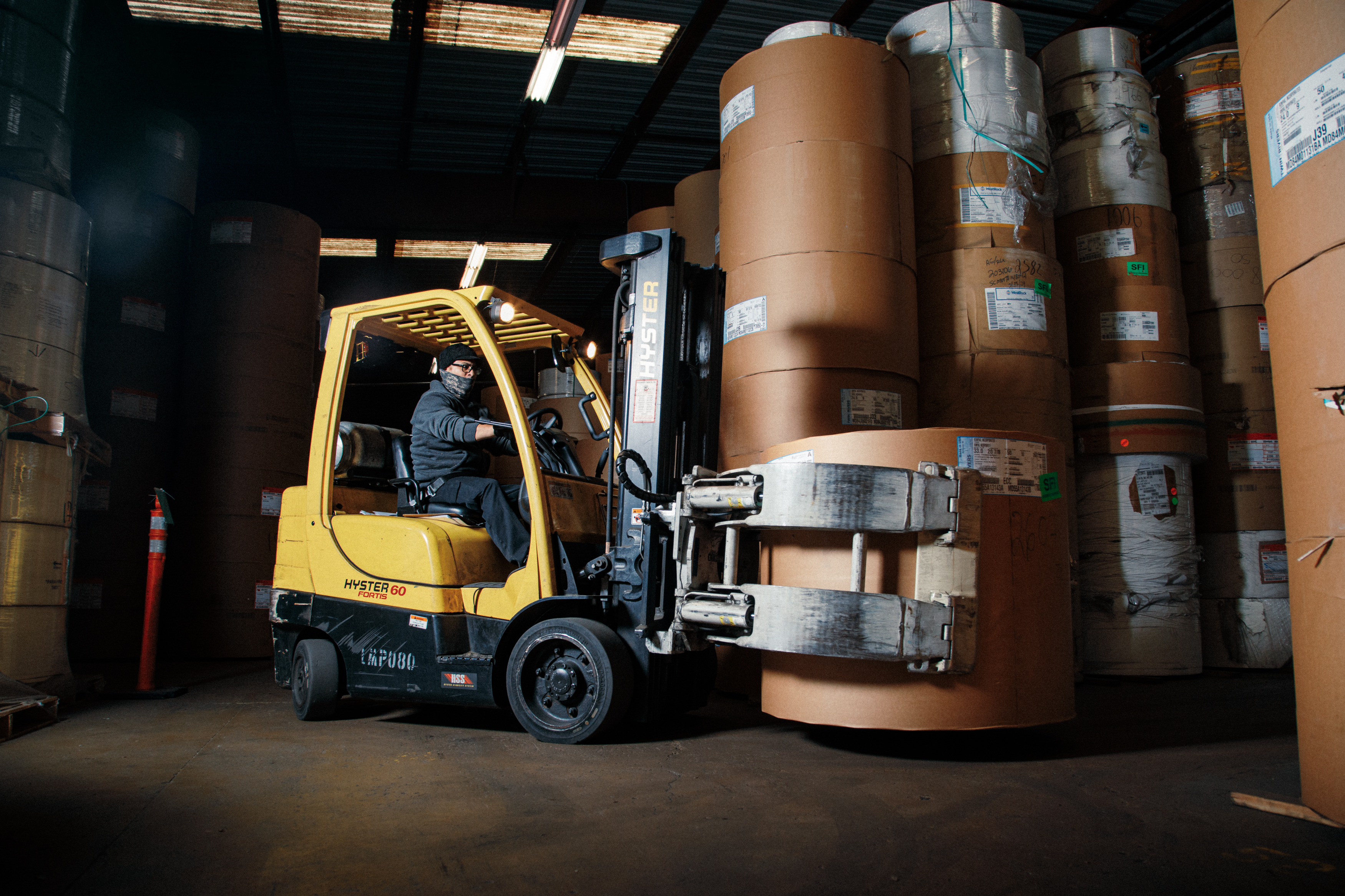
Ronpak is a world leader in custom printed paper packaging, with a 99% on-time delivery record and decades of manufacturing legacy. None of that was visible. When they came to MAP360, they had no brand identity to speak of, a single blue logo, and a tagline they were not willing to change.

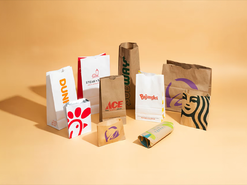
The challenge was not just cosmetic. Paper packaging is a category where most competitors look interchangeable. To win business, Ronpak needed to feel like the obvious premium choice before a single sales conversation started. The brief was simple: increase sales. What that actually required was building a brand from the ground up, within hard constraints.

"How do you make paper packaging feel modern? How do you build an entire visual language from a logo you are not allowed to touch?"

We could not change the logo. We could not change the tagline. Everything else was the job.

Ronpak website Ronpak factory photography

Constraint as System

The existing logo contained a secondary mark: a simple R set inside an isometric box. Most designers would have ignored it. Instead, we used it as the seed of an entire pattern language. Tiled, scaled, and layered, that single geometric element became the foundation of a visual system that felt ownable without touching the primary logo.

The bigger breakthrough was material. Ronpak's product is paper, so we photographed it. Close-up, high-resolution shots of actual Ronpak packaging stock became a texture system applied across every touchpoint. It was not a metaphor or a stylistic gesture. The brand literally became the product. The material authenticity it created was something no competitor could replicate without using Ronpak's own paper.

We modernized the website around three pillars that set Ronpak apart in the category: their sustainability practices, their manufacturing legacy, and their 99% on-time delivery record. These were not marketing claims invented for the brief. They were real operational strengths the company had never thought to lead with.

Factory photography Website detail Ronpak video sizzle

Making It

With creative direction and associate creative direction shared between myself and Anthony Spera, we produced the full brand system with a small, trusted team. Marc Cuvin executed graphic and web design, translating the visual direction into production-ready assets and a rebuilt website. Photographer Eli Ritter shot both the product and facilities under my direction, with staging and art direction handled on set. Videographer Kris Khunachak captured the footage, and edited the two films based on new brand direction.

The first film is a one-minute sizzle anchored around a single question: why Ronpak? The answer is visual as much as verbal. The second is a three-minute deeper dive that shows not just what Ronpak makes, but what it feels like to work there. The response from Ronpak employees was overwhelmingly positive, which mattered. A brand that the people inside the company are proud of works harder than one imposed from outside.

The result was a company that finally looked like the category leader it already was.

Scope of Work

01
Brand System
Pattern language, texture system, typography, color, and usage guidelines extrapolated from existing logo assets.
02
Website Redesign
Full rebuild positioning Ronpak's sustainability, legacy, and operational record as competitive advantages.
03
Photography
Product and facility shoot. Art directed and staged on location, edited by photographer Eli Ritter.
04
Film ×2
A 60-second brand sizzle and a 2.5-minute company profile. Directed and produced by me. Shot & edited by cinematographer Kris Khunachak.

Next Project

Puma Hoops